flex 布局
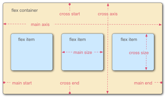
flex 模型由哪些概念组成?
- main axis: main start → main end;
- cross axis: cross start → cross end;
- flex container:
display: flex的元素; - flex items: 容器的直接子元素;
- main size / cross size: item 在两轴上的尺寸;
flex-flow 简写如何书写?
- 作用: 设置 main axis 方向与换行方式;
- 成分属性:
flex-wrap、flex-direction;
element {
  flex-flow: column;
  flex-flow: column-reverse wrap;
}
flex-direction 有哪些取值?
#col-rev {
  flex-direction: row; /* 默认, inline-start → inline-end */
  flex-direction: row-reverse; /* inline-end → inline-start */
  flex-direction: column; /* block-start → block-end */
  flex-direction: column-reverse; /* block-end → block-start */
}
flex-wrap 有哪些取值?
.content {
  display: flex;
  flex-wrap: nowrap; /* 默认, 不换行 */
  flex-wrap: wrap; /* 换行, main-start → main-end */
  flex-wrap: wrap-reverse; /* 换行, main-end → main-start */
}
flex 简写如何书写, 常见值有哪些?
- 成分属性:
flex-grow、flex-shrink、flex-basis; - 常见值:
flex: 1=1 1 0%;flex: 2=2 1 0%;flex: auto=1 1 auto;
#flex-container > .flex-item {
  flex: auto;
}
flex-grow 如何分配剩余空间?
- 默认 0, 不参与放大;
- 存在剩余空间 x 时, 第 i 个 item 增加 ( 为各 item 的 flex-grow);
flex-shrink 如何分摊溢出?
- 默认 1, 参与收缩;
- 溢出 x 时, 第 i 个 item 缩小 ( 为 flex base size, 为 flex-shrink);
flex-basis 如何设置基础尺寸?
.box1 {
  flex-basis: auto; /* 依容器, 无尺寸时视为 content */
  flex-basis: content; /* 依内容 */
  flex-basis: 3px; /* length */
  flex-basis: 3%; /* percentage */
}
order 如何改变排列顺序?
- 作用于 flex/grid item;
- 数值越小越靠前;
main > article {
  order: 2;
}
align-/justify- 属性分别作用于哪个轴?
justify-*: main axis 方向;align-*: cross axis 方向;
items、self、content 三组属性有何区别?
*-items: 设置所有 item 的对齐方式;*-self: 设置单个 item 的对齐方式, 取值同 items;*-content: 设置 item 组的整体分布, 用剩余空间分配;
.flex {
  align-items: center; /* start/end/stretch/flex-start/flex-end */
  justify-content: space-between; /* space-around/space-evenly */
}
.flex-items {
  align-self: stretch;
}