grid 布局
grid 布局
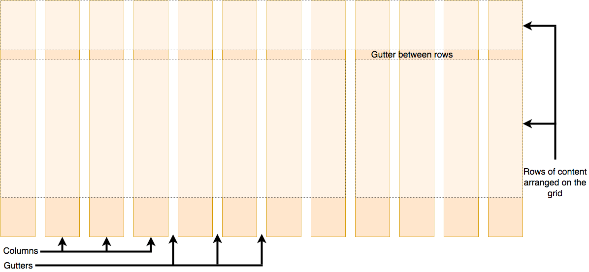
组成部分
- rows;
- columns;
- gutters: columns 和 rows 之间的空隙;
示意图
grid 属性值
- 容器创建 grid 布局;
.container {
  display: grid;
}
grid-template-rows 属性
- 设置 grid 行名 (custom-ident);
- 设置 grid 行轨道大小;
.container {
  /* 使用 grid-auto-rows 属性 */
  grid-template-rows: none;

  /* length 类型 */
  /* percentage 类型, 设置各轨道 flex 比例系数, fr 后缀 */
  /* flex 类型 */
  grid-template-rows: 1fr 2fr 1fr;

  /* 设置尽可能大的最大宽度, 最小宽度 */
  grid-template-rows: 10px max-content;
  grid-template-rows: 10px min-content;

  /* minmax(min, max) 函数 */
  grid-template-rows: 10px minmax(min, max);
  /* 单独使用视为 minmax(min-content, max-content) */
  grid-template-rows: 10px auto;
  /* repeat() 函数 */
  grid-template-rows: 10px repeat(2, 1fr);

  /* 设置 grid 行名, 名称为除保留字之外的有效字符串 */
  grid-template-rows: [linename1] 100px [linename2 linename3];
}
grid-template-columns 属性
- 同 grid-template-rows 属性;
- 将行换做列即可;
grid-auto-rows 属性
- 当无 grid-template-rows 属性;
- 或其属性值为 none 时;
- 自动使用 grid-auto-rows 属性;
- 属性值同 grid-template-rows 属性;
#grid {
  display: grid;
  grid-auto-rows: 100px;
}
grid-auto-columns 属性
- 同 grid-auto-rows 属性;
- 将行换做列即可;
repeat() 函数
作用
-
作为 grid-template-rows(columns) 的属性值;
-
使用更简洁的方式表示重复的 track list 参数;
-
repeat count + tracks;
- repeat count;
- int;
- auto-fill;
- auto-fit;
- tracks;
- tracks size;
- repeat count;
-
可存在多个 tracks sizes;
- 空格分隔;
- 表示 abc, abc 形式, 依次重复多个 tracks sizes;
#container {
  display: grid;
  grid-template-columns: repeat(2, 50px 1fr) 100px;
}
尽可能多的列
- 使用 repeat() 函数;
- 使用 auto-fill;
- 使用 minmax();
- 第一个参数为设置的最小值;
- 第二个参数为 1fr, 自动拉伸;
.container {
  display: grid;
  grid-template-columns: repeat(auto-fill, minmax(200px, 1fr));
}
auto-fill 和 auto-fit
- 相同之处;
- 设置重复次数为尽可能大的数字;
- 使对应方向不会溢出;
- 最小为 1;
- 不同之处;
- 当容器宽度大于所有重复子元素的总宽度;
- auto-fill 保留空白通道;
- auto-fit 折叠空白通道;
- 空白通道空间平均分配给其他通道;
minmax() 函数
- 用于 gird 布局;
- 设置最大最小值范围;
- minmax(min, max);
#container {
  display: grid;
  grid-template-columns: minmax(min-content, 300px) minmax(200px, 1fr) 150px;
}
gap 属性
作用
- 设置 flex/gird/multiple column 布局 gutters 尺寸;
#flexbox {
  display: flex;
  gap: 20px 5px;
}
成分属性
- row-gap;
- column-gap;
简写机制
- 1 value;
- gap
- row-gap = column-gap = gap;
- 2 value:
- row-gap column-gap;
column-gap 属性
- 见 multiple columns;
row-gap 属性
- 同 column-gap 属性;
- 将列换做行即可;
基于网格线的放置
grid-column 属性
作用
- 设置 grid item 基于 grid column 的位置和尺寸;
定位机制
语法格式
#item {
  grid-column: 2 / 4;
}
成分属性
- grid-column-end;
- grid-column-start;
简写机制
- 1 value;
- grid-colum-start;
- 2 value;
- gird-colum-start / grid-colum-start;
grid-column-start 属性
- 设置 grid item 基于 grid column 的起始位置和尺寸;
#item {
  /* 默认值, 等同于 span */
  grid-column-start: auto;
  /* 正数: 基于正数第 i 列 */
  /* 负数: 基于倒数第 i 列 */
  grid-column-start: 2;
  grid-column-start: -2;

  /* span [int], 表示横跨 int 列, int 缺省为 1 */
  /* 单独使用 span, `grid-column-start: span 2` 等效于 `grid-column: i / span 2` */
  grid-column-start: 1 / span 2;

  /* custom-ident 列名 */
  grid-column-start: test;
}
grid-column-end 属性
- 同 grid-colum-start 属性;
- 表示终止位置;
grid-row 属性
- 同 grid-column;
- 把列换成行;
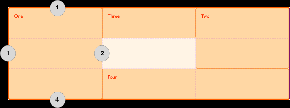
网格区域命名
grid-template-areas 属性
作用
- 容器命名网格区域, 与 grid-row/column, grid area 联合使用;
- 同一行同一引号包裹;
- 同一行不同列空格分隔;
- 不同行引号分隔;
#page {
  display: grid;
  width: 100%;
  height: 250px;
  grid-template-areas:
    "a a ."
    "a a ."
    ". b c";
  grid-template-rows: 50px 1fr 30px;
  grid-template-columns: 150px 1fr;
}
原则
- 一旦使用, 必须填充所有网格;
- 使用 .视为该网格不命名;
- 命名网格区域必须为矩形;
- 同一命名网格必须相连;
grid-area 属性
- 指定 grid item 的命名网格区域;
- 设置 grid item 基于 grid column/row 的位置和尺寸;
- grid-row-start / grid-column-start / grid-row-end / grid-column-end;
/* 指定 grid item 的命名网格区域 */
#page {
  display: grid;
  width: 100%;
  height: 250px;
  grid-template-areas:
    "a a ."
    "a a ."
    ". b c";
  grid-template-rows: 50px 1fr 30px;
  grid-template-columns: 150px 1fr;
}
#item1 {
  grid-area: a;
}
/* 设置 grid item 基于 grid column/row 的位置和尺寸 */
#item1 {
  grid-area: 2 / 2 / auto / span 3;
}