文本
书写模型
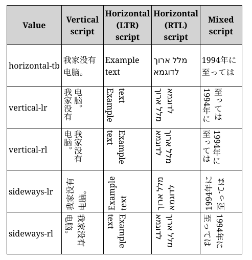
书写模型
- writing-mode 属性;
- 定义书写模型, 控制书写方向;
.example {
  /* 横向, 从左到右 */
  writing-mode: horizontal-tb;
  /* 纵向, 从右到左 */
  writing-mode: vertical-rl;
  /* 纵向, 从左到右 */
  writing-mode: vertical-lr;
}
块级布局和内联布局
- lnline: 文字方向;
- block: 段落方向;


文本布局
水平对齐
- text-align 属性;
- 设置水平对齐方式;
.example {
  text-align: start;
  text-align: end;
  text-align: left;
  text-align: right;
  text-align: center;
  text-align: justify;
}
行间距
- line-height 属性;
- 设置行间距;
div {
  /* 默认值 */
  line-height: normal;
  line-height: 1.2;
}
字间距
- letter-spacing 属性;
- 设置字间距;
.normal {
  /* 默认值 */
  letter-spacing: normal;
  letter-spacing: 1.2;
}
词间距
- word-spacing 属性;
- 设置词间距;
#mozdiv1 {
  /* 默认值 */
  word-spacing: normal;
  word-spacing: 1.2;
}
字体效果
字体变换
- text-transform 属性;
- 设置字体变换;
span {
  text-transform: none;
  text-transform: capitalize;
  text-transform: uppercase;
  text-transform: lowercase;
  text-transform: full-width;
}
字体阴影
- text-shadow 属性;
- offset-x | offset-y | blur-radius | color;
- 添加字体阴影;
.red-text-shadow {
  text-shadow: 1px 2px 2px red;
  /* 可叠加, 逗号分隔 */
  text-shadow: 1px 1px 2px black, 0 0 1em blue, 0 0 0.2em blue;
}
字体修饰
简写属性
- text-decoration;
- 添加字体修饰线;
.over {
  text-decoration: wavy overline lime;
}
成分属性
- text-decoration-color;
- text-decoration-line;
- text-decoration-style;
字体修饰线位置
- text-decoration-line 属性;
- 设置字体装饰线位置;
.both {
  text-decoration-line: none;
  text-decoration-line: underline;
  text-decoration-line: overline;
  text-decoration-line: line-through;
  /* 可叠加 */
  text-decoration-line: underline overline;
}
字体修饰线样式
- text-decoration-style 属性;
- 设置字体装饰线样式;
.wavy {
  text-decoration-style: solid;
  text-decoration-style: double;
  text-decoration-style: dotted;
  text-decoration-style: dashed;
  text-decoration-style: wavy;
}
字体修饰线颜色
- text-decoration-color 属性;
- 设置字体装饰线颜色;
逻辑属性
inline-size 和 block-size 属性
作用
- 适用于不同书写模式;
机制
- inline-size: inline 方向;
- block-size: block 方向;
padding, border 和 margin
逻辑属性
- xxx-block-start;
- xxx-block-end;
- xxx-inline-start;
- xxx-inline-end;
上下左右对应逻辑值
- block-start;
- block-end;
- inline-start:
- inline-end;
超链接样式和鼠标样式
超链接样式
- link: 下划线;
- unvisited: 蓝色;
- visited: 紫色;
- hover: 鼠标显示为小手图标;
- focus: 方框包裹;
- active: 红色;
鼠标样式
- cursor 属性;
- 设置鼠标样式;
.bar {
  cursor: auto;
  cursor: none;
  cursor: help;
  cursor: pointer;
  cursor: progress;
  cursor: wait;
  cursor: text;
  cursor: move;
  cursor: wait;
  cursor: not-allowed;
  cursor: grab;
  cursor: zoom-in;
  cursor: zoom-out;
}
最佳实践
省略文本
单行文本
- overflow 控制元素溢出方式;
- text-overflow 控制文本溢出方式;
- white-space 控制文本换行方式;
.text {
  overflow: hidden;
  text-overflow: ellipsis;
  white-space: normal;
}
多行文本
基于高度
- 设置 relative 布局建立 position context;
- overflow 控制元素溢出方式;
- 基于行数手动计算 height 和 line-height;
- 使用 : : after 和 absolute 布局添加省略号;
.demo {
  position: relative;
  line-height: 20px;
  height: 40px;
  overflow: hidden;
}
.demo::after {
  content: "...";
  position: absolute;
  bottom: 0;
  right: 0;
  padding: 0 20px 0 10px;
}
-webkit-box
- overflow 控制元素溢出方式;
- text-overflow 控制文本溢出方式;
- white-space 控制文本换行方式;
- -webkit-box 修改为弹性伸缩盒子样式;
- -webkit-box-orient 修改盒子模型排列方式;
- -webkit-line-clamp 显示显示行数;
.text {
  display: -webkit-box;
  -webkit-box-orient: vertical;
  -webkit-line-clamp: 3; /* 显示三行文字 */
  overflow: hidden;
  text-overflow: ellipsis;
  white-space: normal;
}